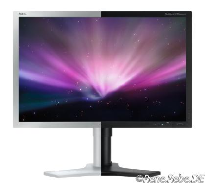
The perfect display color
My current displays are a little aging, and with Apple not coming out with updated Cinema Display, and disqualifying itself with those glossy ones I can not work with (too many reflections, need my eyes some more years, …) I got to think about what be the perfect display color. White (light, grey, silver, aluminum, etc.), or black. Some argue for some improved visual screen contrast with black border. Currently my very old ViewSonic display are kind of silver (plastic), and the likewise, but less, aging Apple Cinema Display is aluminum:
Just comment, what do you think?


April 20th, 2010 at 15:48
The perfect display color is definitely genuine aluminum coming with the older Apple Cinema Displays. Hence these new crappy Apple reflector displays are no option, I agree that there is need for an alternative solution.
For an all black setup, you know from most PC workstations, there is certainly need for a black display. But for a setup with mostly Mac hardware and white/aluminum accessories, a black one wouldn’t match at all. I myself gave a grey NEC display a try, but was disappointed very soon, due to this old-school look.
A real alternative came along with the new design of the 23″ NEC EA231WMi. It comes with an apple-like white combined with aluminum-like silver (plastic) bezel. This is real good design and the IPS panel has been reviewed by PRAD with a good test result. Unfortunately, this design is not available for many of NEC displays as yet.
September 1st, 2010 at 11:19
Now got a black one, so far so good. Nicely neutral. I guess there is this contrast enhancing reason why the new Apple iMac’s and glossy Apple display got this black border.
The black NEC display separates screen content from the surrounding reality, likewise.