Wired iTunes 10 software update
So I wanted to see the Ping (:-) and update to iTunes 10 (though that will probably not bring back syncing to my [secondary] Palm Pré, sigh). The iTunes built-in software update tells me “This version of iTunes (9.2.1) is the current version.” – hm, really? I really have to go to Apple’s website to pull it manually? How easy and streamlined is that? Ok, let’s check the system software update, and indeed “New software is available for your computer.”:
iTunes 10 comes with many new features and improvements, including:
• Introducing Ping. Use Ping to follow your favorite artists and friends or connect with the world’s most passionate music fans. Discover the music everyone is talking about, listening to, and downloading.
• Rent HD TV episodes for just 99¢ each. Watch them on your Mac or PC, on-the-go with iPhone or iPod touch, or in your living room with the all new Apple TV.
• Play your favorites on the all new iPod touch, iPod nano, iPod shuffle, and Apple TV.
• Play music wirelessly with AirPlay on AirPlay-enabled speakers, home theater receivers, and iPod accessories.
• Explore many look-and-feel improvements throughout iTunes.
• Enjoy performance improvements which make iTunes faster and more responsive.
• Additional voice support with VoiceOver Kit for iPod.
For information on the security content of this update, please visit: http://support.apple.com/kb/HT1222
At least, unlike Safari, it does not require a reboot, just to quit Xcode, and iTunes itself (do I really have to be notified of the later, and quit it myself?), …
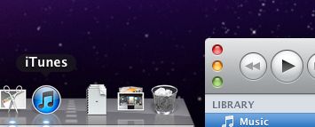
Update: Oh my god! What have they done to the window controls! This traffic lights look ugly! And so does the new icon, oh my, oh my, …

Update 2: In the meantime the iTunes App feed directly get’s the 10 update, too, … and it looks like I hit a nerve with the icon and window decoration criticism, … Personally I do not like the icon, because it simply does not match with any other icon in my dock, neither the Finder, Mail, Safari, Cal, Preview, Xcode, et al. Mostly because the others are not as round. Whatever. The window decoration, however, is really annoying. The fragmentation of Mac UI elements, where every App brings it’s own variants, really contradicts usability and users getting to a look and feel. This really is not what the Mac user experience once meant to be and reminds me on the Unix world, where each X11 environment brings it’s own toolkits, usability, and look’n feel, …
